A dash of colour
They say that animals don’t see in colour, but I do wonder. I’ve been told that dogs see in a sort of sepia way, and am learning that birds see colours we don’t, and also ultraviolet light. I tend to see in stone colours – or at least refer to stone to describe – ‘oh, that flower is just the colour of the speckles in High Fell sandstone’ etc. I wonder what it is that makes a colour a ‘favourite’, or why some colours appeal more than others.
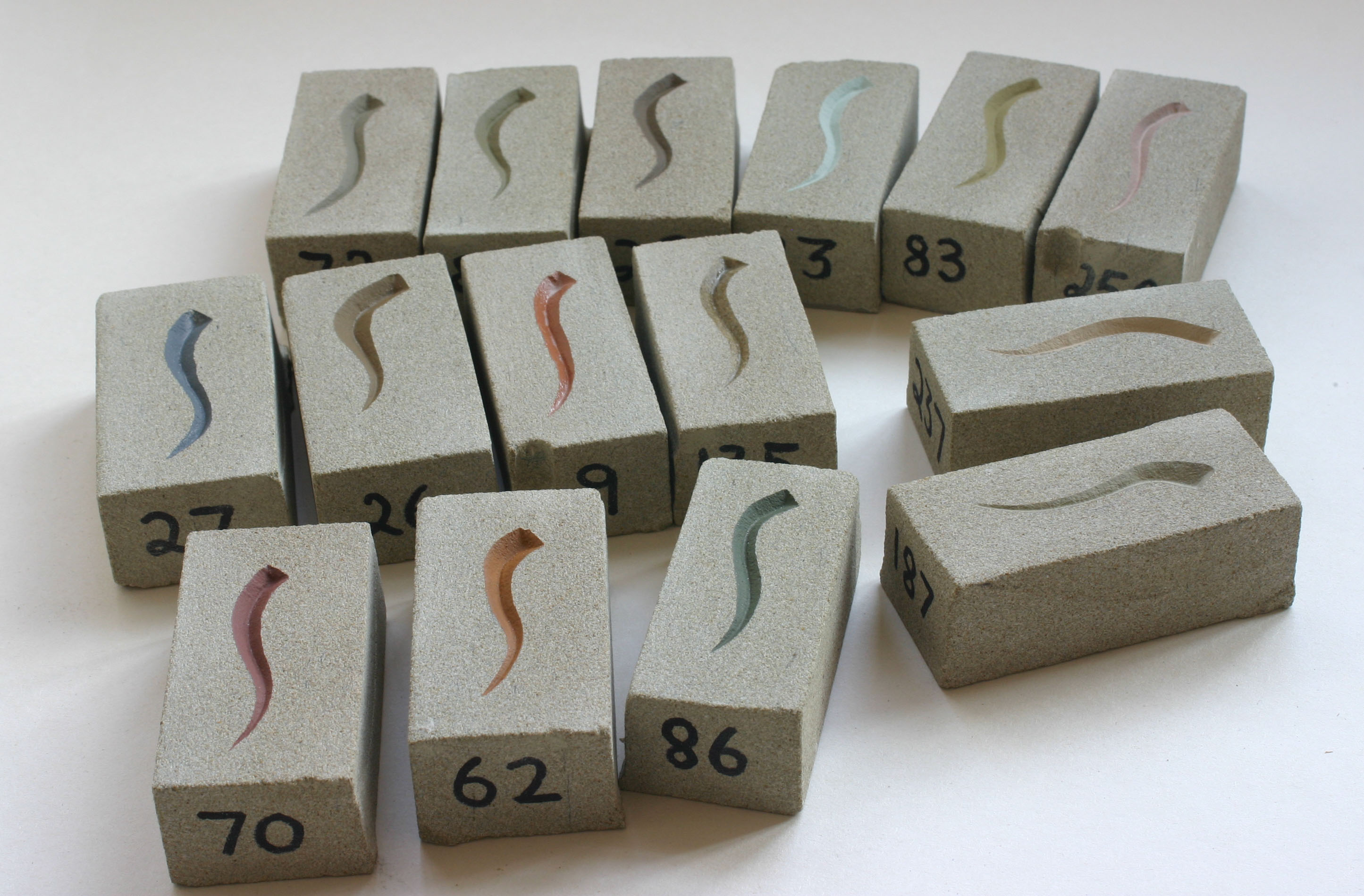
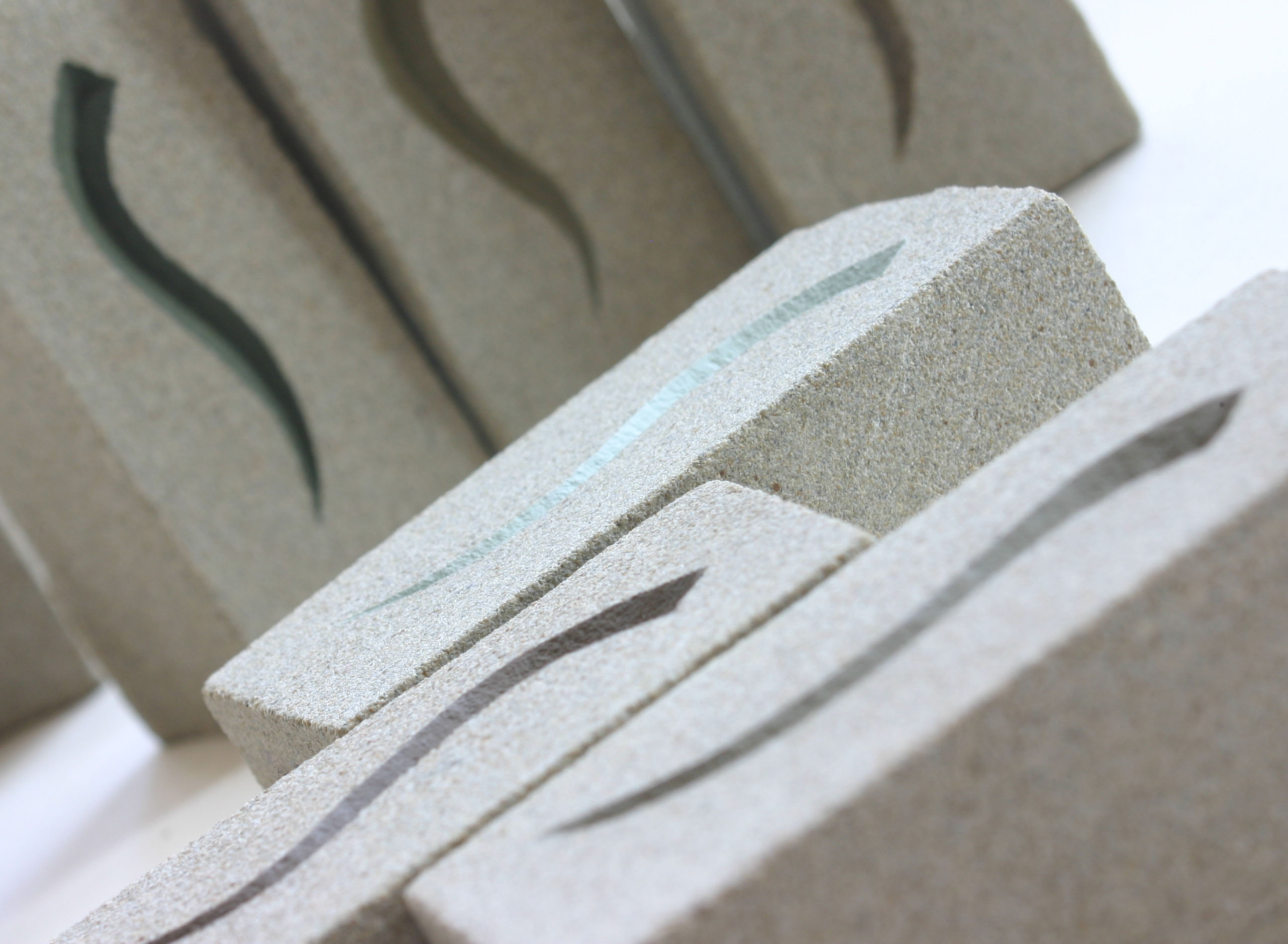
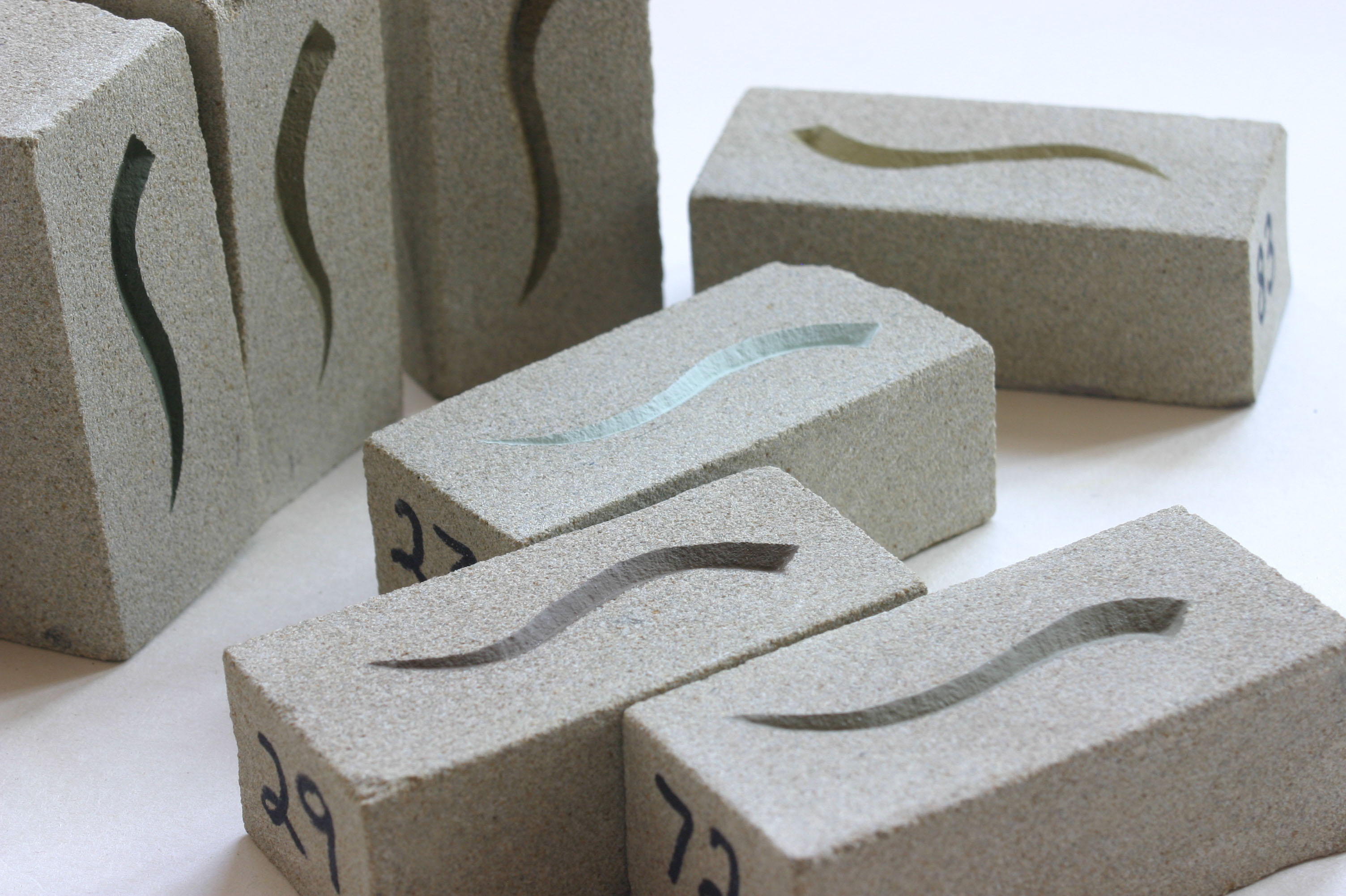
I’ve been making some colour samples on small chunks of stone to see what colours look good on stone. It is so difficult to imagine from a paint pot lid, or colour chart, just what a colour will look like in reality – so hopefully these will help anyone who would like the lettering I have carved for them, painting. The purpose of painting lettering can be to make the letters stand out more (useful if it is a house name plaque) and also it can help to protect them.
I carved a little squiggle on each oblong of stone and painted them all different colours, remembering to code them so I would know which colour was from which paint pot. Some have a matt finish and others gloss, so there is quite a choice – or of course you can just leave the letters natural, fresh chiseled colour! Which reminds me, I need to do a sample for that.
4 Comments
Even you sample bricks look nice with there little squiggle, think I would have to leave mine plane though…
Amanda xx
Mostly letters I cut are left natural Amanda – I remember an old mason telling me many years ago, that I should never paint letters, that the quality of carving should always prevail, and there should be no need to enhance in any way – needless to say he was a very skilled letter-cutter!
My hounds definitely see some colours, but of course whether the colours they see are the colours I see is something else entirely.
I do like 86. But I think I far prefer to see the stone unadorned.
It seems naturally cut letters get the vote